The Process of Painting
Here are a number of shots of one of my recent paintings Ascension as it was being created. Some of the shots are fuzzy, and my apologies. All images are copywrite 2005 by the artist.

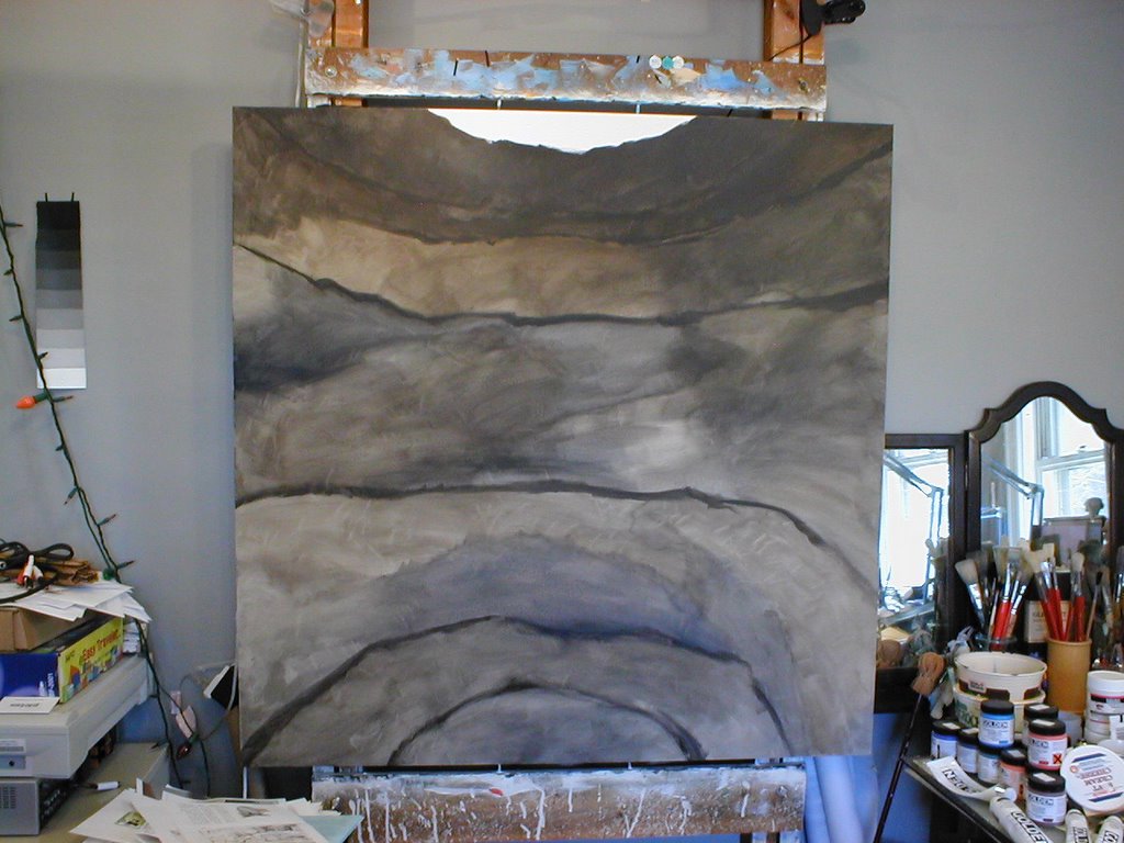
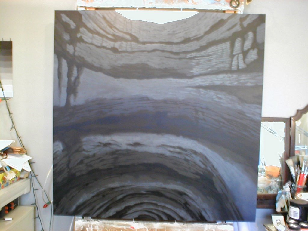
Based on some photo research into caves and sinkholes, the first level of underpainting begins. Because the view is from inside the sinkhole, the perspective is rather forced. I like to work with Raw Umber a lot for my ground tones, mixing with Mars Black for shadows which gives a warmth to dark areas. I tend to reserve Ivory (or Bone) Black for 'ultimate' shadows, as this gives me a greater range in shadow.

Here I have begun cutting in the deeper darks, and toning the stone into cooler colors.

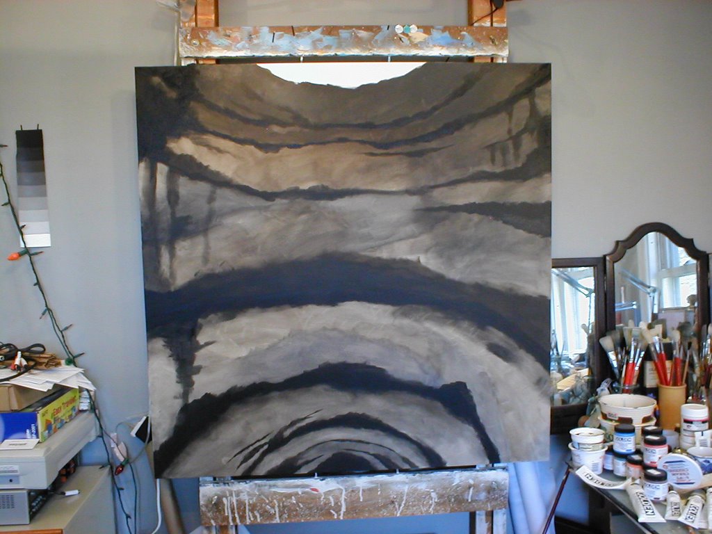
The next step pushes the darks deeper and more into the blue range, anticipating the colors needed to suggest mist in the cave. I work up from the bottom in order to work from dark-to-light. Also, I am at this point completely ignoring where the copper spire will go. There is so much open work and windows and such that will show the rock walls through the spire that it will be simpler to paint the architecture in after, over the rocks.


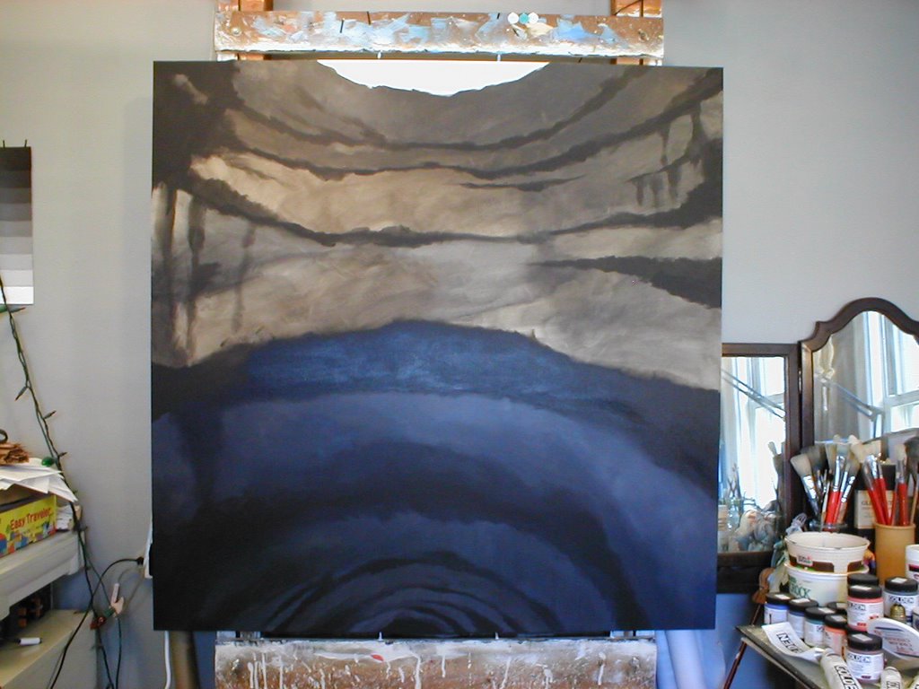
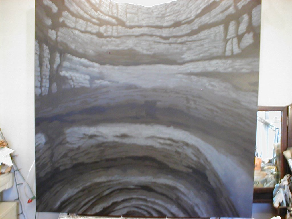
Here the next two steps, where the basic stone colors have been laid in and the individual stone faces are begun.


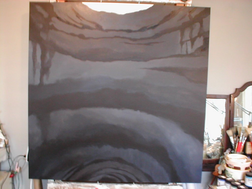
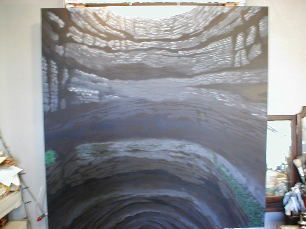
Working from dark to light the rock face becomes more defined. The plants start being added in.

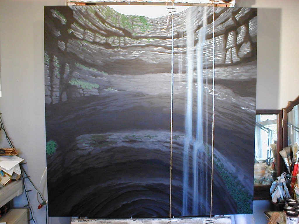
Here I have taped two parallel strings stretched from the top and bottom of the painting to aid the laying in of the waterfalls.

After having sketched out and then drafted out the spire, it gets transfered onto the canvas, and loosely cut in with Raw Umber. For anyone interested, I might add that I work mostly with Golden Acrylics, with a few Liquitex Acrylics that I haven't replaced yet. The Golden paints have a wonderful smooth working quality that I like, have excellent coverage for their opaque colors, and yet can glaze extreemly well. Their transparent colors are vibrant and gorgeous. For greater intensity their High Load Colors are well worth the additional cost, although the color range is much smaller than the regular line.

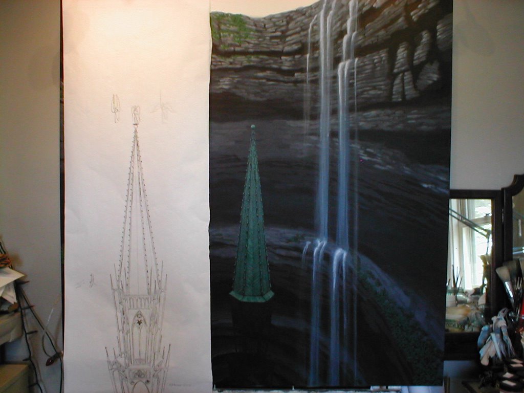
Here the copper work on the spire is begun. Beginning with some very dull greens and then working into dark turquise and more acidic greens I layered it in with small brush strokes following the pattern the metal would have been attached to the origional wooden framework of a real gothic spire.


In the first of these steps the paler and duller tones of the verdigris are added in to the spire roof. Then the rest of the spire's copperwork is laid in, and the angel is added to the top. Finally the rest of the plantwork is laid in, the foggy sky at the top of the sinkhole is based in, and plants added around the top in successive layers. In order to create fog over the top of the whole painting, a thinned off-white glaze was brushed on, and then hurriedly wiped off with paper towels. I'd never tried this and thought at first I had ruined the painting, but it worked! (Thank God!) At the very end, darker vines were added in on either side of the foreground, to give the feeling that the hole wrapped around and that the viewer was standing inside it with plants closer and between them and the spire.
Here are a number of shots of one of my recent paintings Ascension as it was being created. Some of the shots are fuzzy, and my apologies. All images are copywrite 2005 by the artist.
Based on some photo research into caves and sinkholes, the first level of underpainting begins. Because the view is from inside the sinkhole, the perspective is rather forced. I like to work with Raw Umber a lot for my ground tones, mixing with Mars Black for shadows which gives a warmth to dark areas. I tend to reserve Ivory (or Bone) Black for 'ultimate' shadows, as this gives me a greater range in shadow.
Here I have begun cutting in the deeper darks, and toning the stone into cooler colors.
The next step pushes the darks deeper and more into the blue range, anticipating the colors needed to suggest mist in the cave. I work up from the bottom in order to work from dark-to-light. Also, I am at this point completely ignoring where the copper spire will go. There is so much open work and windows and such that will show the rock walls through the spire that it will be simpler to paint the architecture in after, over the rocks.
Here the next two steps, where the basic stone colors have been laid in and the individual stone faces are begun.
Working from dark to light the rock face becomes more defined. The plants start being added in.
Here I have taped two parallel strings stretched from the top and bottom of the painting to aid the laying in of the waterfalls.
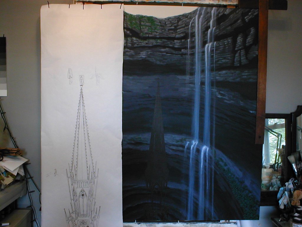
After having sketched out and then drafted out the spire, it gets transfered onto the canvas, and loosely cut in with Raw Umber. For anyone interested, I might add that I work mostly with Golden Acrylics, with a few Liquitex Acrylics that I haven't replaced yet. The Golden paints have a wonderful smooth working quality that I like, have excellent coverage for their opaque colors, and yet can glaze extreemly well. Their transparent colors are vibrant and gorgeous. For greater intensity their High Load Colors are well worth the additional cost, although the color range is much smaller than the regular line.
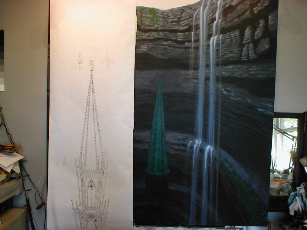
Here the copper work on the spire is begun. Beginning with some very dull greens and then working into dark turquise and more acidic greens I layered it in with small brush strokes following the pattern the metal would have been attached to the origional wooden framework of a real gothic spire.
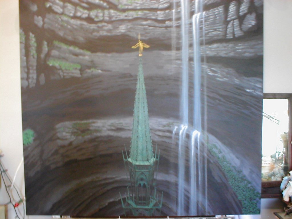
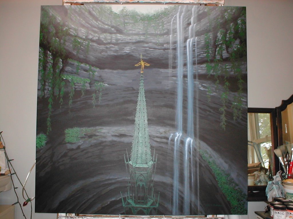
In the first of these steps the paler and duller tones of the verdigris are added in to the spire roof. Then the rest of the spire's copperwork is laid in, and the angel is added to the top. Finally the rest of the plantwork is laid in, the foggy sky at the top of the sinkhole is based in, and plants added around the top in successive layers. In order to create fog over the top of the whole painting, a thinned off-white glaze was brushed on, and then hurriedly wiped off with paper towels. I'd never tried this and thought at first I had ruined the painting, but it worked! (Thank God!) At the very end, darker vines were added in on either side of the foreground, to give the feeling that the hole wrapped around and that the viewer was standing inside it with plants closer and between them and the spire.
Labels: arts, creative follies, my art, painting
posted by Jerub-Baal at 3:32 PM
![]()
![]()


0 Comments:
Post a Comment
<< Home